

Alii is a financial platform tailored to the complex auditing and approval structures of schools and education institutions. Every transaction must be transparent, traceable, and approved through a strict hierarchy within a system that demands clarity and compliance above all.
Web App
Finance
Redesign
Challenge:
The existing product struggled with usability due to outdated flows and UI inconsistencies that compiled over time. While the company wanted to innovate, they also needed to retain familiarity for their older, process-driven user base.
Approach:
Rather than apply a surface-level redesign, I led a complete overhaul of Alii’s UX and UI — grounded in deep research, user interviews, and internal workshops. This included:’
- Redesigning all core user flows based on direct feedback from high-engagement clients and internal stakeholders.
- Striking a balance between modern design and usability for legacy users.
- Migrating the framework to Svelte, leveraging Skeleton UI and Tailwind to streamline developer handoff.
- Building a new design system in Figma, including component libraries and scalable documentation.
- Leading regular product-development syncs to align design, engineering, and stakeholders
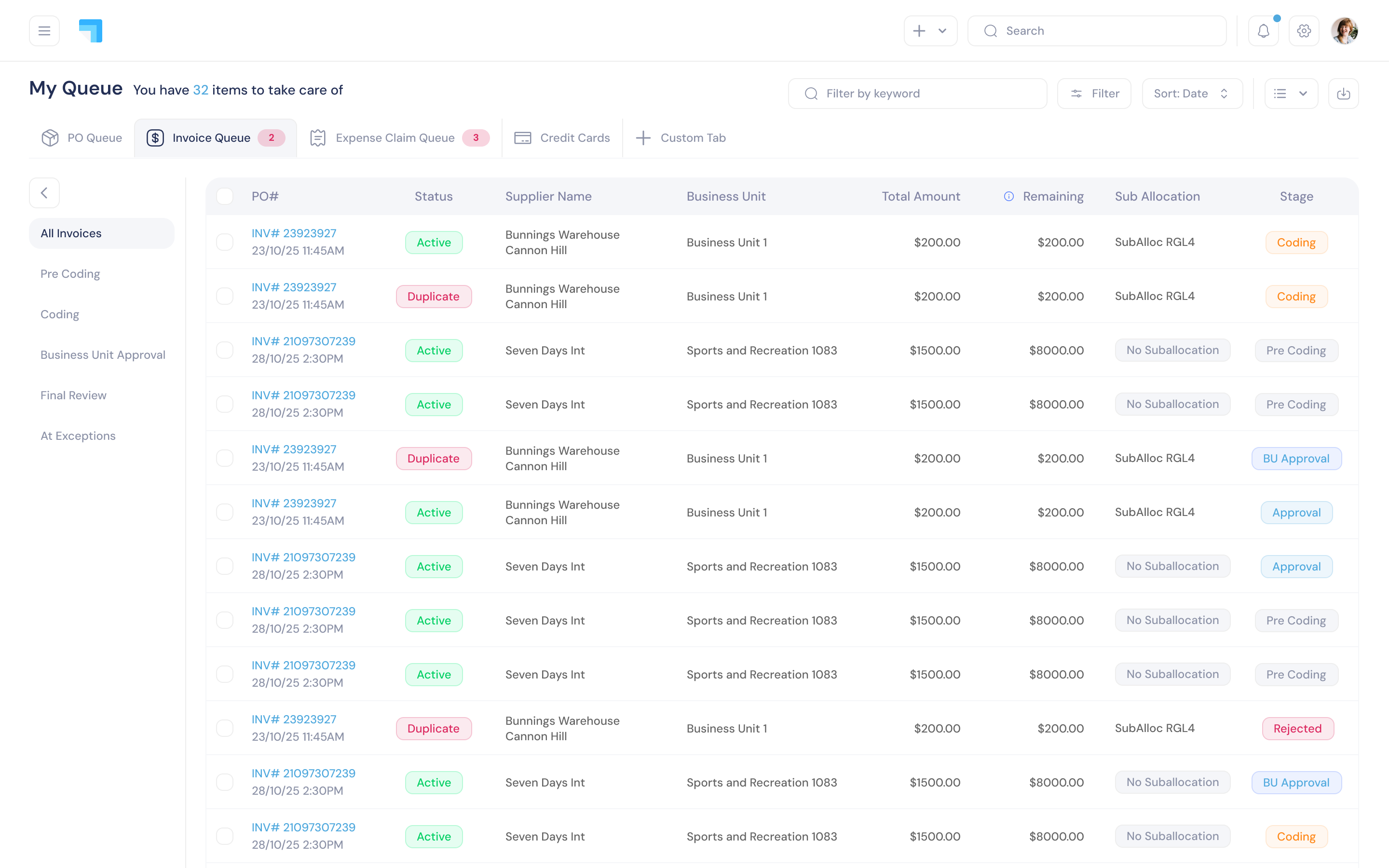
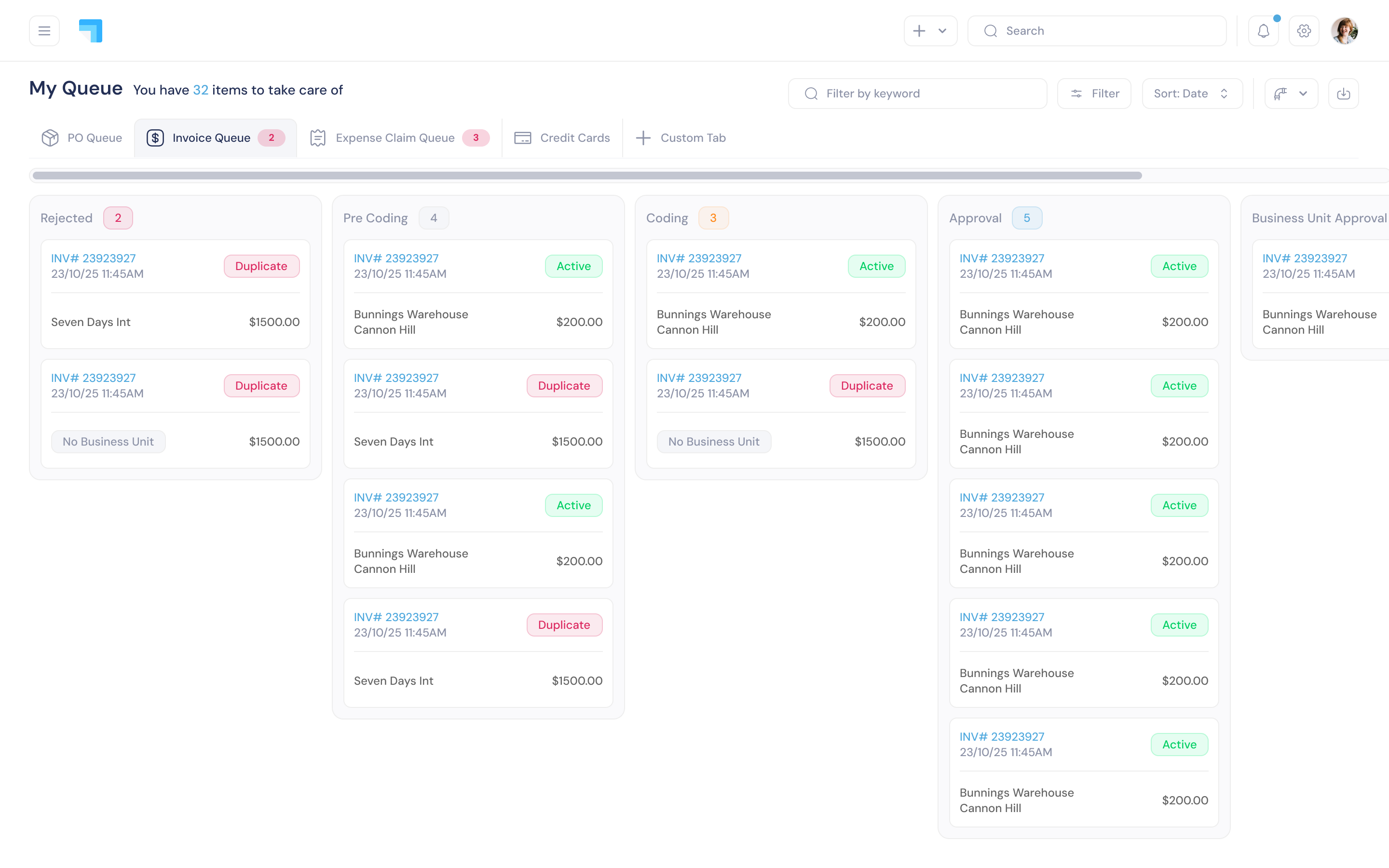
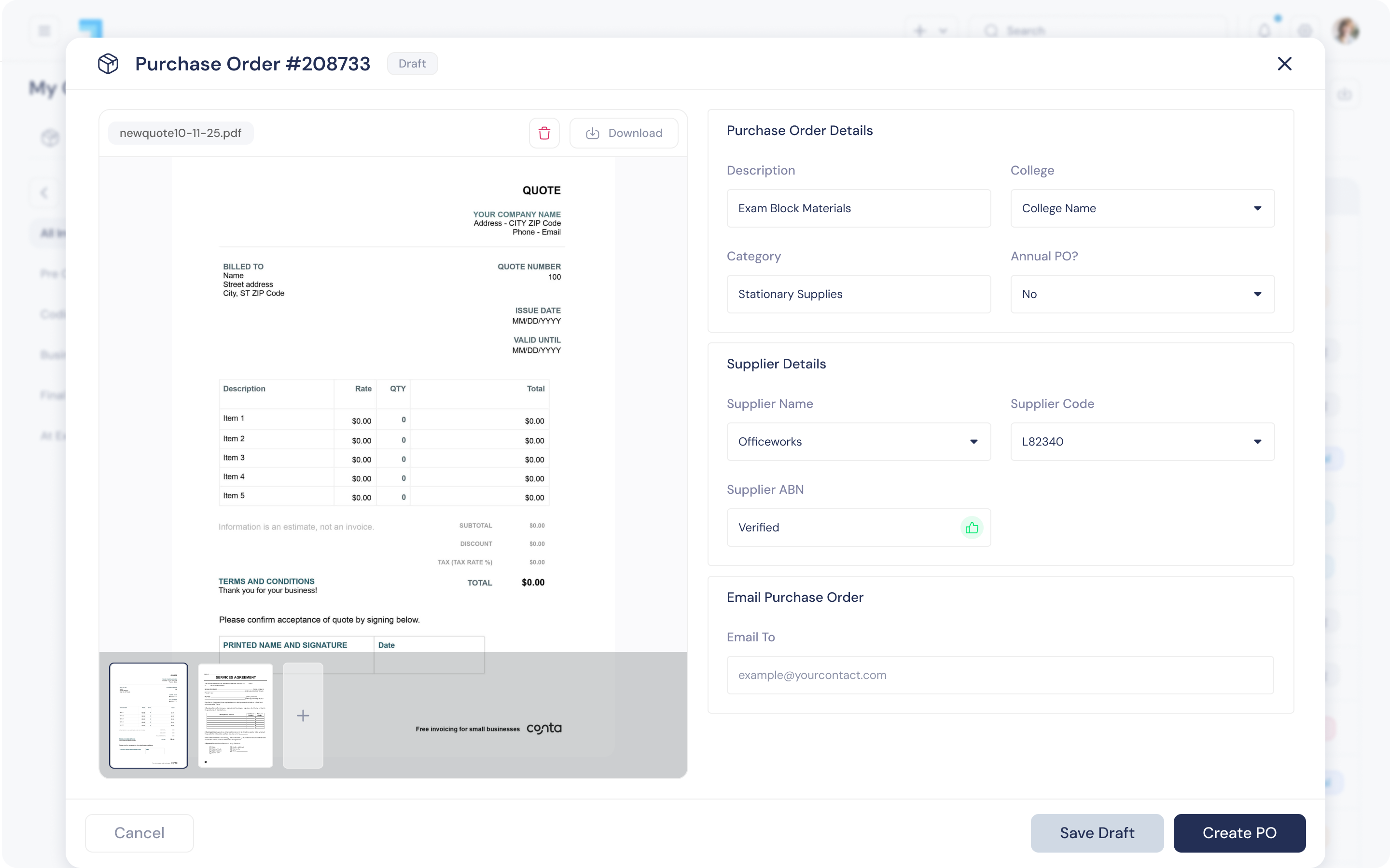
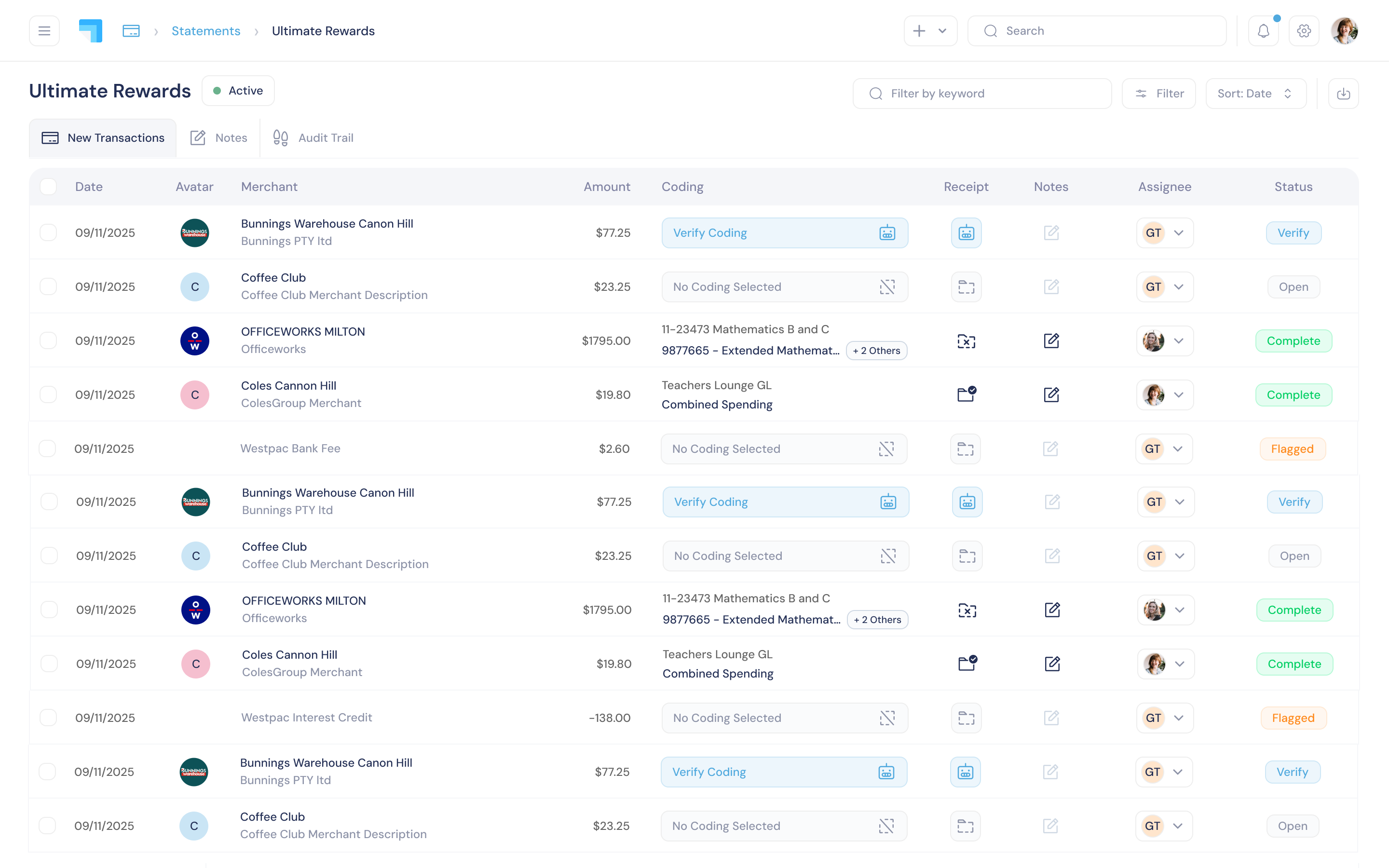
I began with a UI audit, mapping out misalignments, redundant styles and areas that deviated from our design system. The redesign focused on clarity and neutrality: removing decorative elements, standardising spacing, and creating a calm visual baseline that could sit comfortably beneath any customer’s brand.
Most customers place their own logos at the top of the page, so the UI had to behave like part of their identity, not ours. This meant a strictly monochrome palette, with colour used sparingly for clear incident states (up, degraded, down).
Outcome:
A cleaner, more intuitive interface that maintained continuity for existing users while introducing scalable systems and improved UX.
Impact:
The redesign is currently waiting to go into effect after higher priority features are finished. Internal and external feedback has been extremely positive after viewing the prototype and having run through sessions with myself and the product team. This redesign will not only bring across new clients looking for modern software, it will also fix a lot of recurring UI issues our current customers face. Re-designing core components like tables, line items and pipelines is a huge benefit to our power users and creates trust with the people who use our product the most.


Alii is a financial platform tailored to the complex auditing and approval structures of schools and education institutions. Every transaction must be transparent, traceable, and approved through a strict hierarchy within a system that demands clarity and compliance above all.
Web App
Finance
Redesign
Challenge:
The existing product struggled with usability due to outdated flows and UI inconsistencies that compiled over time. While the company wanted to innovate, they also needed to retain familiarity for their older, process-driven user base.

My Design
Approach:
Rather than apply a surface-level redesign, I led a complete overhaul of Alii’s UX and UI — grounded in deep research, user interviews, and internal workshops. This included:’
- Redesigning all core user flows based on direct feedback from high-engagement clients and internal stakeholders.
- Striking a balance between modern design and usability for legacy users.
- Migrating the framework to Svelte, leveraging Skeleton UI and Tailwind to streamline developer handoff.
- Building a new design system in Figma, including component libraries and scalable documentation.
- Leading regular product-development syncs to align design, engineering, and stakeholders
I began with a UI audit, mapping out misalignments, redundant styles and areas that deviated from our design system. The redesign focused on clarity and neutrality: removing decorative elements, standardising spacing, and creating a calm visual baseline that could sit comfortably beneath any customer’s brand.
Most customers place their own logos at the top of the page, so the UI had to behave like part of their identity, not ours. This meant a strictly monochrome palette, with colour used sparingly for clear incident states (up, degraded, down).
Outcome:
A cleaner, more intuitive interface that maintained continuity for existing users while introducing scalable systems and improved UX.
My Design
Impact:
The redesign is currently waiting to go into effect after higher priority features are finished. Internal and external feedback has been extremely positive after viewing the prototype and having run through sessions with myself and the product team. This redesign will not only bring across new clients looking for modern software, it will also fix a lot of recurring UI issues our current customers face. Re-designing core components like tables, line items and pipelines is a huge benefit to our power users and creates trust with the people who use our product the most.